Presentation by Max Nakhapetian
Max investigates how blitzing affects pressure and points allowed for NFL defenses, and asks if it's really worth it.
Max on LinkedIn: https://www.linkedin.com/in/max-nakhapetia.
Max investigates how blitzing affects pressure and points allowed for NFL defenses, and asks if it's really worth it.
Max on LinkedIn: https://www.linkedin.com/in/max-nakhapetia.
Anthony looks at how MLB starting pitching metrics have changed since 2019.
Anthony on LinkedIn: https://www.linkedin.com/in/anthony-mercado-/
Alex Caplan explains his design and application of a new metric in soccer: Expected Pass Completion (xPC)
Abhinav looks at how the OKC defense performs with Chet Holmgren on and off the court.
Abhinav on LinkedIn: https://www.linkedin.com/in/abhinav-arun/
Catcher defense has always been my favorite part of baseball analytics, and so I knew right away that I was going to work on a catcher project with the Harbor Hawks. It ended up being my proudest work of the summer, and I hope to consistently use and improve the project into the future. I’ll start with my initial goals before explaining each component of the report and how they were used. I’ll also create a post soon that details the best catchers on the Cape this season by my metrics. Feel free to comment here or on Twitter if you want to see the report from a specific Cape League catcher!
The reports need to…
Have a single game option in addition to season-long, in order to continually grade and improve our catchers
Have a comparison feature to give context for the numbers
Be understandable and applicable for stats nerds, catchers and coaches alike
Be neat and visually pleasing, easily comprehensible
Be multifaceted, giving insight to framing, blocking and control of the running game
Be repeatable, so that I can easily and automatically generate new reports every day
Be available in PDF form for easy distribution and use

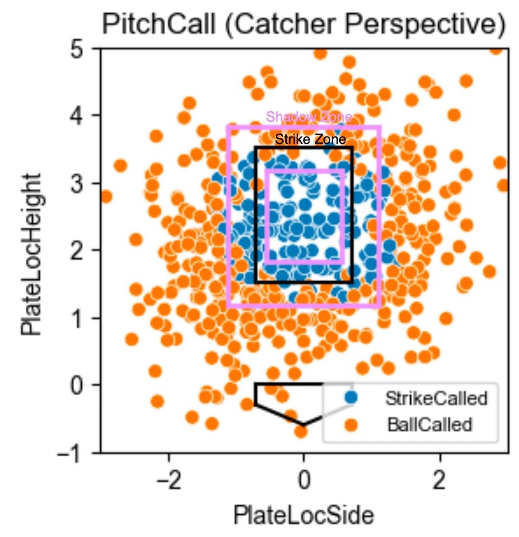
The first step for the report was a fairly simple scatterplot of the Strike Zone with every single called pitch from the chosen game or season. For a single game, you can look at what happened on each individual pitch. With a small sample size, though, each pitch or game could be a fluke, with the umpire heavily swaying the results. I recommended we almost always use the season-long feature, where you can start to see densely colored areas where the catcher is excelling or struggling. I also displayed a “Shadow Zone” which is the area within about a ball of the strike zone, both in and out. This scatter chart was immediately understandable to any coach or player, so I decided to keep it as the centerpiece of my report.
With that simple scatterplot, though, I recognized that the report needed more context and nuance. If you only saw that one plot above, you might think that catcher was elite at stealing strikes off the plate, but that’s not necessarily true. Cape League umpires give about a ball on either side of the zone, consistently calling wide strikes. I approached this problem with a strike probability model, which lent itself to a Strikes Looking Above Average (SLAA) stat.
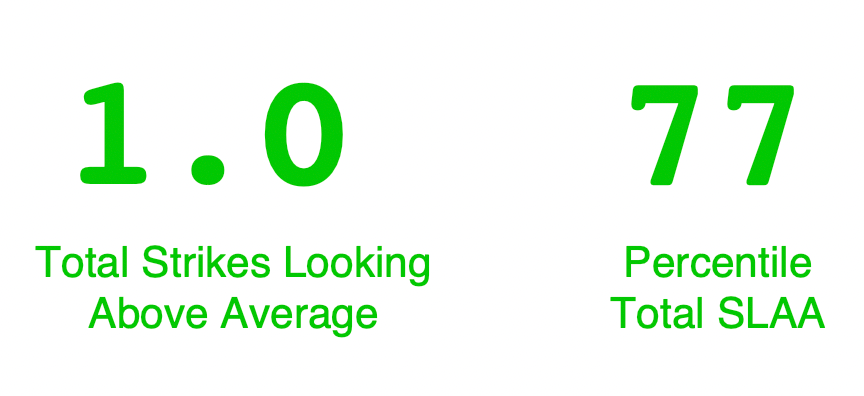
After talking with another intern Aidan Beilke, I trained the model using XGBoost with just batter handedness, pitch vertical location and pitch horizontal location as features. With more data I would want to include the umpires as a training variable, but I still achieved close to 90% accuracy. Similar to Outs Above Average, my SLAA stat was the difference between the modeled strike probability and the actual result. Summing this stat for each called pitch gives the game, or season, SLAA. Because this statistic is compared versus the predicted average Cape League catcher, it gives a lot more context than simple balls and strikes called. Additionally, I think it helps that it’s a stat where 0 is exactly average. To give a sense of scale, I also displayed a catcher’s SLAA percentile on the report.

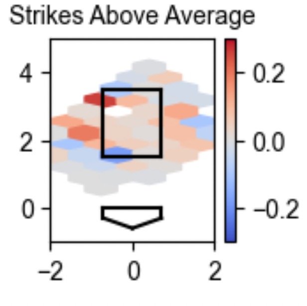
Still, this doesn’t necessarily help a catcher improve. Simply telling them that they’re a good or bad framer likely means nothing. So I converted SLAA into a Strike Zone hexmap to give players a better idea of where they should focus on practicing. Here is the corresponding SLAA graph to the scatterplot and percentiles above.


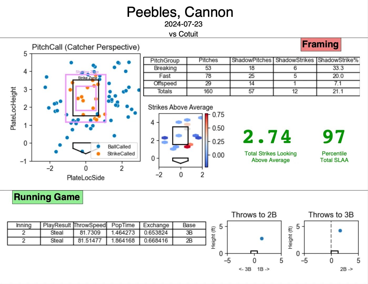
My last framing piece was splitting framing by pitch types. I figured that catchers might have difficulty with different pitches, and so they can look at their technique on those specifically. In the Cape League, I noticed that catchers consistently performed worst on off-speed pitches, at least when it came to the Shadow Zone Strike%. While that could be something for certain players to work on, the fact that it was universal is more a sign that off-speed pitches are harder to frame.

Unfortunately, Trackman does not keep data on blocks and passed balls, so I wasn’t able to incorporate that. With a main focus on framing, the only secondary part to the report was the running game. I’m not completely confident in the Trackman pop times, but I thought at the very least the catchers could use exchange time, throw speed and these throw accuracy charts. The season long options creates averages by base for the metrics on the table.
Even after all the modeling and visualization was done, the majority of my time on this project was spent on the PDF formatting. Like I said in the goals section, a key part of this project is its ease-of-use. I strongly believe that an unappealing or messy report won’t get used as heavily by the coaches and players. Aidan recommended I use Python package FPDF, which works out well with a lot of trial and error for positioning your elements. I separated my charts and tables by Framing and Running, and emphasized the main two elements: the pitch call scatterplot and the total SLAA number and percentile.


When I completed this project midway through the season, our primary catchers were Jaxson West (Florida State) and Cannon Peebles (Tennessee). Both ended the season with above average framing, and they were devoted to sharpening their craft. At different points, I showed them both their season-long framing reports, explaining what each thing meant and what I thought they would work on. Jaxson, for example, was losing strikes at the bottom of the zone, which held back his plus framing everywhere else. At this point in my career, I’m not comfortable suggesting mechanical tweaks, but in the future I look forward to combining statistical suggestions with physical ones.*
For the most part, I’ll be able to easily translate the Catcher Reports over to the NCAA season considering schools use the same Trackman system as the Cape. However, I’ll have to make a decision on how I train the model– with a small 10-team league like the Cape, I felt comfortable assuming the umpires would have a small and consistent rotation. But with over 300 D1 baseball teams and almost 30 conferences, I can no longer make that assumption. The best option might be to give SLAA scores that are trained and compared only to a catcher’s own conference.
Additionally, a long term goal would be to create MLB catcher reports, which I haven’t seen any of in the sports data world. MLB StatCast would open up a new world of blocking metrics, and also allow the extra variable of umpires. Maybe someday there can even be a Twitter bot for these reports.
Just like my first project, a big thank you to fellow interns Aidan Beilke, Gabe Appelbaum, Richard Legler and Tyler Warren, as well as my bosses Cole Velis and Mikey Lucario
Another Baseball Ops Intern, Tyler Cosgrove, taught me a ton about the art of catching this summer and shared a lot of his experience.
I used Nick Wan's code on Kaggle to visualize the Strike Zone and Shadow Zone.
TJStats and UmpScorecards (by Ethan Singer and Ethan Schwartz) are both major inspirations for this project, with their pitcher and umpire reports respectively.
All data comes from Trackman Baseball
Thanks for reading, and let me know if there’s a Cape catcher report you want to see!
*And if you have any recommendations on catcher coaching books, articles, or videos, please share them!
When it comes to Cape League roster attrition, there is only so much you can prepare for. In March, every team’s roster looks great, full of All-Americans and future first-rounders. On Opening Day in June, the managers are probably still pretty happy with where they stand– maybe a pitcher or two dropped out, but the core of the roster is still intact. Soon after, though, the Cape teams are scrambling. The ace of your rotation is getting shut down for the summer. An infielder hit the transfer portal and needs to take visits. A school keeps a high leverage reliever at school work on a strength program, and your top option for replacing him is already in another league. Your first baseman’s team goes on an unexpected run in Omaha, Team USA poaches a few of your very best, and then an MLB team decides to take a flyer on your starting centerfielder. This isn’t specifically what happened to the Harbor Hawks, or any Cape team, but it’s accurate in terms of quantity and impact. The reasons may be different for each player and team, but no matter what, every roster looks completely different during the August playoffs than it did in the preseason.
The replacement game is critical for Cape League teams, and our operations/analytics group for Hyannis was empowered to find potential players and suggest them to the Front Office. Hyannis used 27 batters and 32 pitchers over the course of the season, seriously considering all of our suggestions, some of whom became critical players. After a semester learning how to use machine learning models in Python, I wanted to try to use basic NCAA stats to predict Cape League offensive production. Ideally, this model would identify overlooked candidates for further vetting and also give some insight into how a batter’s conference can impact their Cape performance.
My NCAA data came from baseballr (Bill Petti and Saiem Gilani), where I was able to pull stat lines for every D1 player for years 2021-2023. Unfortunately, trying to pull 2019 caused errors I couldn’t quite fix or explain, so I had to go with just three seasons. A possible next step in this model would be to instead use Robert Frey's collegebaseball package whenever he finishes it. With the current setup, I went year by year and pulled players from each university in that year. The data came with some column shifting issues, which I fixed in R and then wrote to a CSV for each year.
Conference strength ratings were a key goal of this project from the very beginning, because with apologies to Gabe Appelbaum, OPSing .900 in the Atlantic 10 is pretty different from doing it in the SEC. Boyd's World was the best resource for this, so I pulled season-end conference ratings for each year I was considering. Considering schools play fairly different non-conference schedules, a more in-depth approach would be to look at a more comprehensive strength of schedule metric.
Cape Cod League stat lines were the final peace of the puzzle, and I calculated those with the play-by-play files I had. I brought the CSV’s into Python, where I’m more comfortable and know the machine learning packages. Before merging, I chose to replace certain names for a common standard. For example, if a “Zachary” was listed as “Zach” in the NCAA data, I wanted to make sure his data correctly merged with the Cape data that listed him as “Zachary.” ChatGPT helped to generate a list of common names and their replacements. (Michael → Mike, Steven → Steve, etc.) I also stripped all whitespace to get rid of any inconsistencies in that area.
After merging the trifecta of college data, college strength of conference and Cape data, I used the 2024 MLB wOBA weights to calculate both NCAA and Cape wOBA. This was certainly not an ideal strategy, and eventually fellow interns Gabe, Aidan and Richard calculated Cape wOBA, but at the time this was the best I had. If anyone has NCAA wOBA weights, feel free to reach out, but of course the run environment will be incredibly different across divisions and even conferences.
The Cape wOBA was my target (or “Y”) variable, and the NCAA stats (including wOBA and conference rating) were my feature (or “X”) variables. After splitting my data into an 80/20 train/test split to score the models, I went into training.
I initially went with four regression models to compare:
Multiple Linear
Bagging
Random Forest
XGBoost
Here are their scores without any tuning:
The more advanced model types are classically overfit, which can be improved by both more data and better tuning. (Side note: What other model scores should I be looking at?) The bagging model was the most promising, so I moved forward with that one.
I used three strategies to tune the bagging regressor model:
Grid Search testing to find the best parameters for number of estimators, maximum samples to use to train each estimator and maximum number of features to use to train each estimator
Result: n_estimators=50, max_samples=.6, max_features=.2
Recursive Feature Elimination to select the optimal number and subset of features. Another intern recommended I sum doubles and triples into one column, which helped the model.
Result: AB, H, 2B+3B, HR, SO, BB, OBP, SLG, wOBA, Conference Rating
At Bat Qualifiers to have a hefty sample size for each player in both of their seasons. After starting off with a one per game qualification to use for training and testing (56 for NCAA season, 44 for Cape season) I tuned this for the best possible model.
Result: NCAA Season minimum 56 AB, Cape season minimum 50 AB
204 Rows before train/test split
While still clearly overfit, the tuning process improved sliced my error metrics in half. With the standard deviation of Cape wOBA at .0563 for these years, I felt like the model was fairly good. To put that into perspective, I found that the predicted Cape wOBA was within .09 over 92% of the time. So it’s not exactly a pinpoint predictor– if my model predicted a player’s wOBA at .320 (above average), we would be 92% sure he would actually land between a .230 and a .410 wOBA on the Cape, the difference between an abysmal season and a historically great one. I’ll get more into how I actually used the model in a later section.
It makes sense that NCAA wOBA was the most important feature, and that OBP was the next most. The early assumption that conference strength was an useful feature also turned out to be true. Our General Manager Nick Johnson always says that on the Cape, “the whiff translates, but the power doesn’t,” and now he’s got some data to back him up. Strikeouts were much more important to the model than home runs.
The fun part for me was looking at what the model actually predicted for 2024, and seeing if it passed the hype test. I took the 2024 NCAA data and used it to predict what each player’s Cape wOBA would be. Here are the top 5 predicted Cape wOBAs:
This is a list that encompasses the best and worst of my model. At first glance, I was excited to see Charlie Condon and Jac Caglianone highly ranked, as the two best hitters in college this year. I tried to tell the Harbor Hawks to consider taking them, but apparently they were busy with the MLB Draft or something. The two guys above them are more interesting. To me, Mark Shellenberger’s (Evansville) prediction isn’t bad at all. He had an incredible college season with a 1.2 OPS and walked 50% more than he struck out. He’s not Condon, but I would love to have him on the Cape. My model doesn’t know about eligibility though, and he’s exhausted his. He did, however, put up some good stats in the Northwoods and Cape Leagues in previous years before slumping in the MLB Draft League this summer. According to his Twitter, continues to wait about undrafted free agent opportunities, and I would love to see a team give him a shot.
Jordan Smith (George Mason) wasn’t as impressive as Shallenberger and it was in a weaker conference, but I do at least see some of the vision. He strikes out a lot but hits for some solid gap power. He’s done with college baseball as far as I can tell, but I’m not sure where he’ll go next. Preston Shelton (Murray State) is where the model gets way off the mark– an OPS of .658 in an average conference? I just can’t grasp what the model saw in him, but maybe a few very similar profiles raked in the Cape League and this is just another problem with overfitting.
Want to look at the model’s prediction for your favorite player? See the Google Sheet here.
Due to the low confidence levels of my model and some obvious whiffs on certain players, the predictions became more of a name-finder than anything. When we needed to fill a need at a certain position, I would filter for freshmen and sophomores at that position, sort by their wOBA prediction and go down the list. Isaac Wachsmann (Xavier) was a player I found this way, who I felt like was an under-the-radar Cape candidate with a .322 wOBA prediction (73rd percentile). We needed a corner outfielder at the time, and the model liked him, so I dove deeper:
This year, 1.132 OPS with .700 SLG. in 108 PA
Got some BABIP luck but still pretty interesting.
10 HR, really good for his number of PA
24.1% K Rate, 11% BB rate.
Somewhat passive in terms of swinging: 66% IZSwing, 18% Chase, 30% FPS
vs 90+ mph (n=125 pitches):
.526 SLG
14.3% Chase
11.1% In Zone Whiff
15.6% Whiff (fairly low whiffs)
91.2 avg ExitVelo
111 max ExitVelo,
10% Barrel
vs 75+ Breakers (n=121):
.667 SLG
32.8% Chase
16.7% IZ Whiff
36.2% Whiff
93.8 ExitVelo
111.5 Max ExitVelo
22% Barrel
Gonna miss a lot verse breakers and doesn't have great swing deciscions overall, but I don't think it's unplayable given what we need on our team at the moment. Exit velos against those good pitches are pretty promising as well. Swing looks quick with nice hands, good line drive hitter
I'm going to take a deeper look at defense later, first look it seems playable but average at best as a corner OF.
The model found the name, but I did a lot more work before I put him in front of my bosses. In the end, we didn’t sign him, but Orleans actually did. He slashed .188 / .229 / .344 for them in 35 plate appearances a (low sample) miss by my model.
I would love to extend this project with advanced data on each hitter rather than just the traditional counting and rate stats– specifically, I think Whiff%, Chase%, Launch Angle and EV90th (or your Exit Velocity stat of choice) would bring this model even further. Plus, of course, more data is always better.
Although the model didn’t become a go-to tool for Hyannis, the process still taught me plenty. Just like you can expect to find in data science everywhere, the most frustrating and time consuming part was just the data scraping and cleaning. Tuning was tough as well, but ultimately rewarding as the model improved with each iteration. Taking this project from raw data to final predictions developed my skills in many different Python concepts.
Thank you to the other analytics interns: Aidan Beilke, Gabe Appelbaum, Richard Legler and Tyler Warren. Richard recommended Boyd’s World and Tyler shared his code to convert play-by-play files to player stat lines. All four were incredibly helpful when I had questions about code and model tuning.
This video from Robert Frey helped a lot when it came to using the baseballr package for NCAA data. Excited to see more with the collegebaseball package!
Thanks a ton to the work done by Boyd's World to create conference strength ratings, not to mention the other fascinating stuff on his site. My personal favorite is the External Factor Index
Credit to the creators of the baseballr package, Bill Petti and Saiem Gilani.
Follow us on Instagram and LinkedIn!